Oaken
Packaging Design
Designer
Shreekar Lathiya
Services
Packaging Design / Label Design
Background
Oaken Preserves prides itself on using only the freshest and highest quality ingredients in all their products. They work closely with local farmers to source their fruits and ensure that they are picked at the peak of their ripeness for maximum flavor and nutritional value. Additionally, Oaken Preserves is committed to sustainable and eco-friendly practices in their production process, minimizing their environmental impact and supporting a healthier planet.
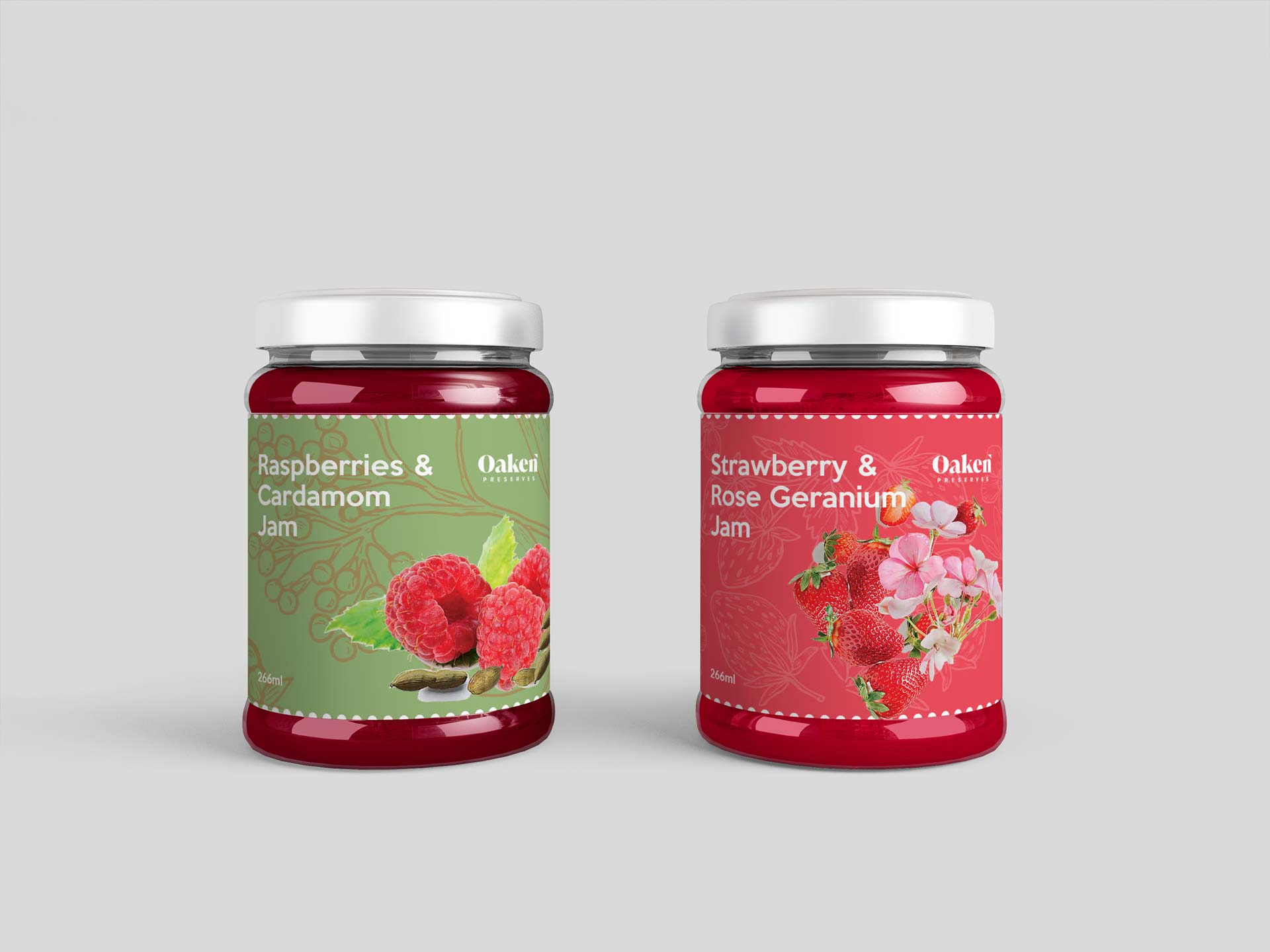
I was chosen by Oaken Preserves to develop packaging that effectively communicates their dedication to utilising only natural, premium ingredients. In the very competitive jam business, the design will assist them in setting their brand apart from rivals and creating strong brand identification. Effective packaging design is essential for grabbing potential clients' attention and conveying the quality and value of their items.
Process
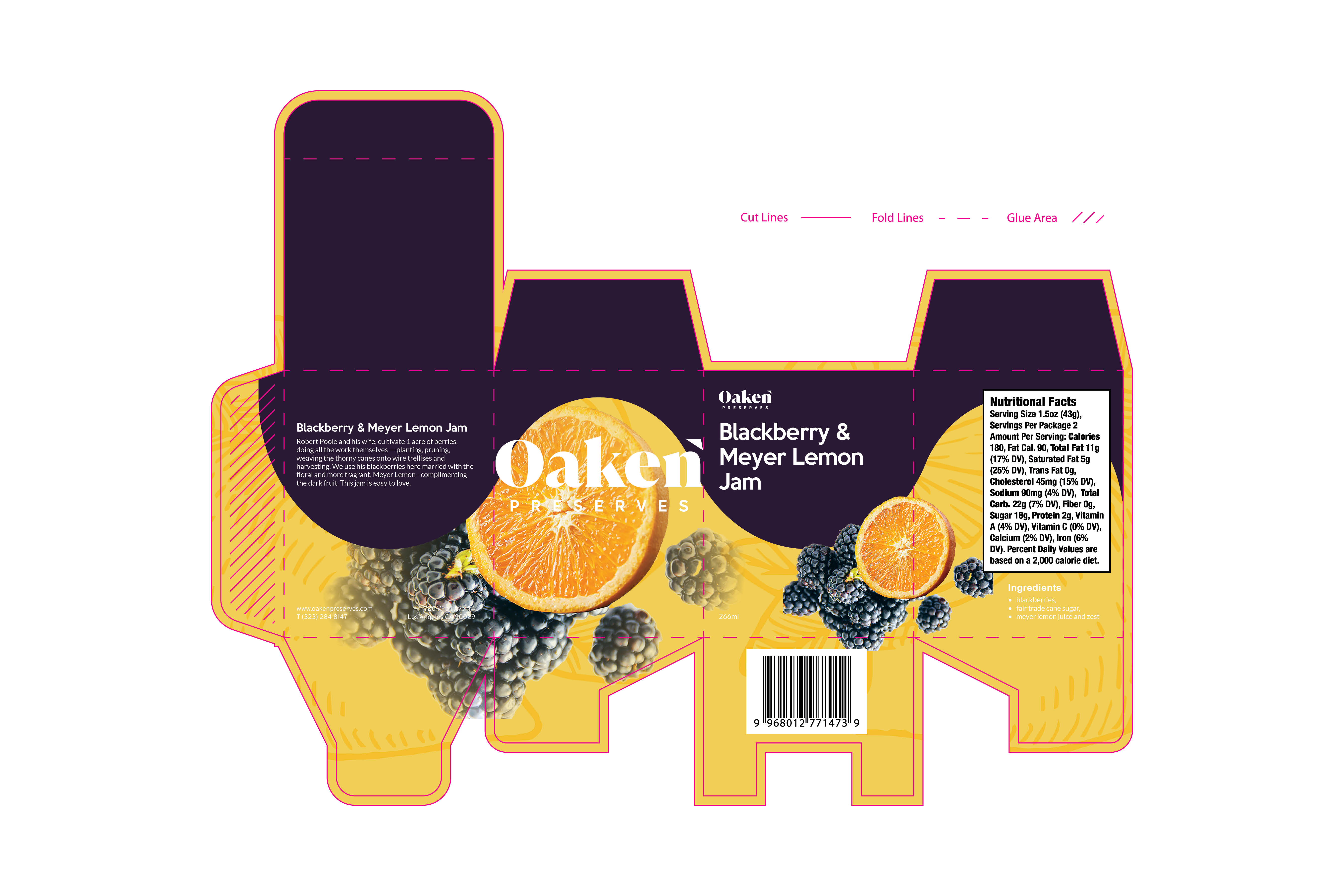
In response to the client's request for a strong presence and the desire to establish continuity among their jam products, my approach involved creating packaging continuity through the clever utilization of space and color. I conceived a captivating wave design that effortlessly captures attention and guides customers' gaze seamlessly from one flavor to the next. While the initial flavor packaging might not have appealed to all customers, the design ensured their attention swiftly transitioned to the subsequent flavor, maintaining engagement and curiosity. To bring this concept to life, I meticulously developed a die line for the packaging, strategically placing key product information and barcode elements. Finally, I materialized the design by printing a sample and meticulously crafting a prototype package, ensuring that the final product embodies the envisioned aesthetic and functionality.
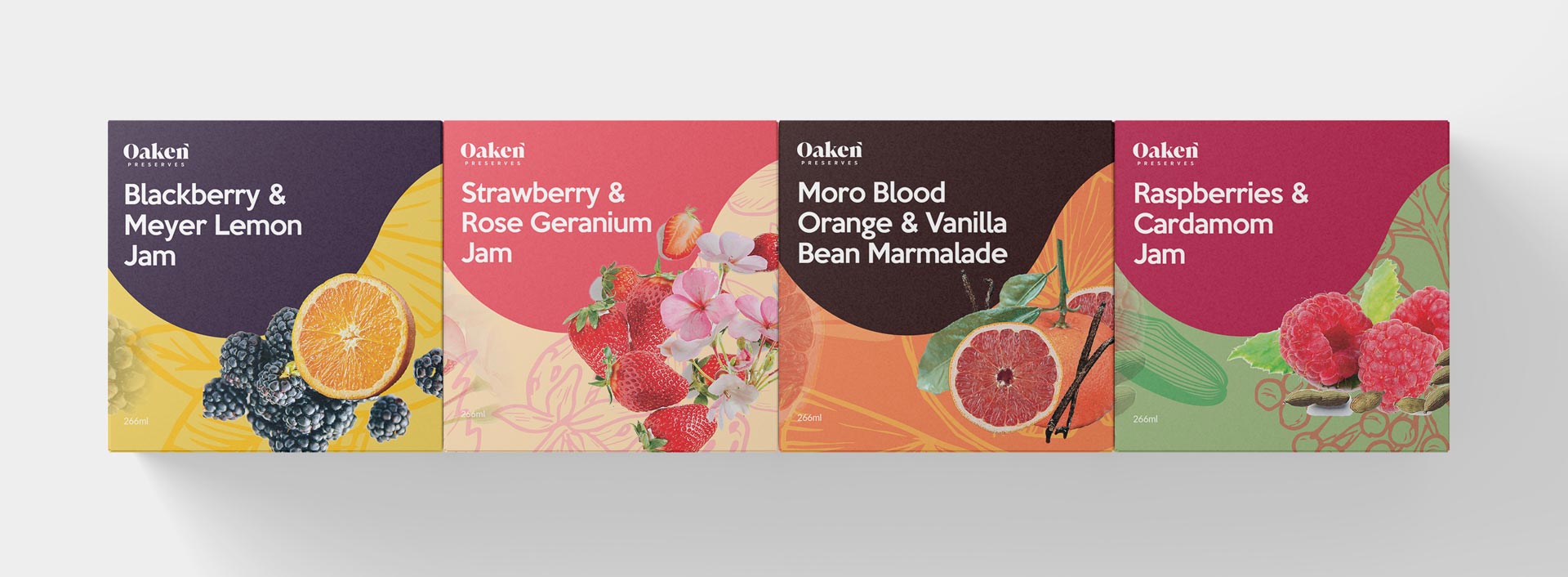
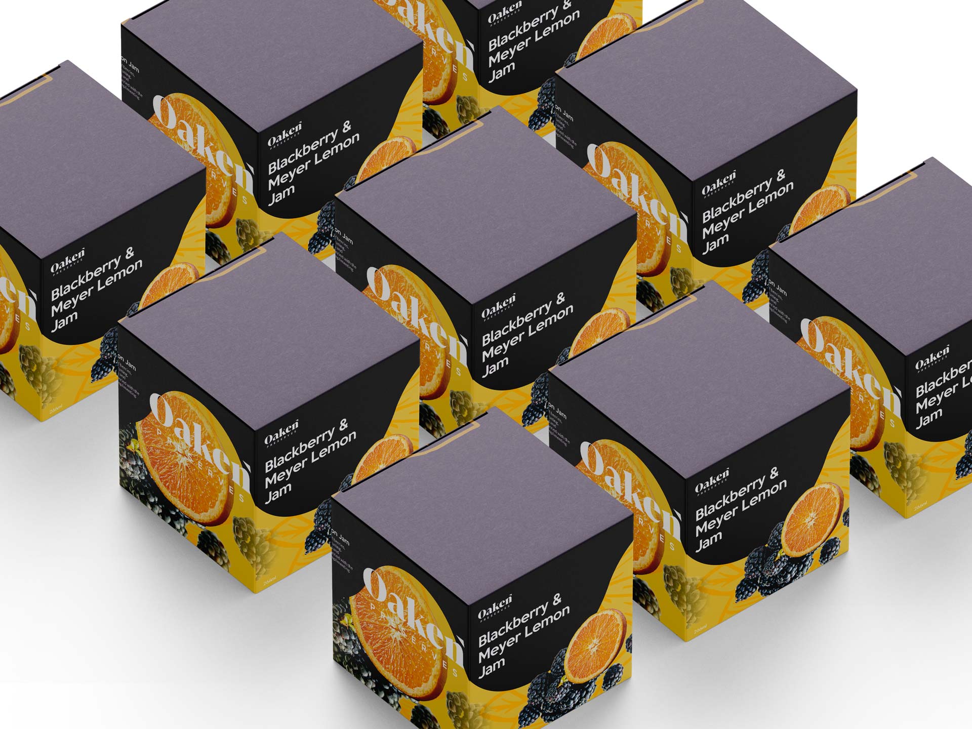
By harmoniously blending visual appeal, strategic flow, and essential product details, the packaging design aims to both captivate and inform potential customers. The wave design, with its dynamic and fluid nature, serves as a visually striking representation of Oaken Preserves' commitment to quality and natural ingredients. Through careful consideration of customer preferences and behaviors, the design provides a seamless visual journey, leading the viewer from one flavor to the next, generating intrigue and encouraging exploration. The resulting packaging not only amplifies Oaken Preserves' presence on store shelves but also effectively communicates the essence of their products, positioning them as a trusted choice for those seeking exceptional, artfully crafted jams.
What I did
- PACKAGE DESGIN
- BOOKLET
- LABEL
- DIELINE
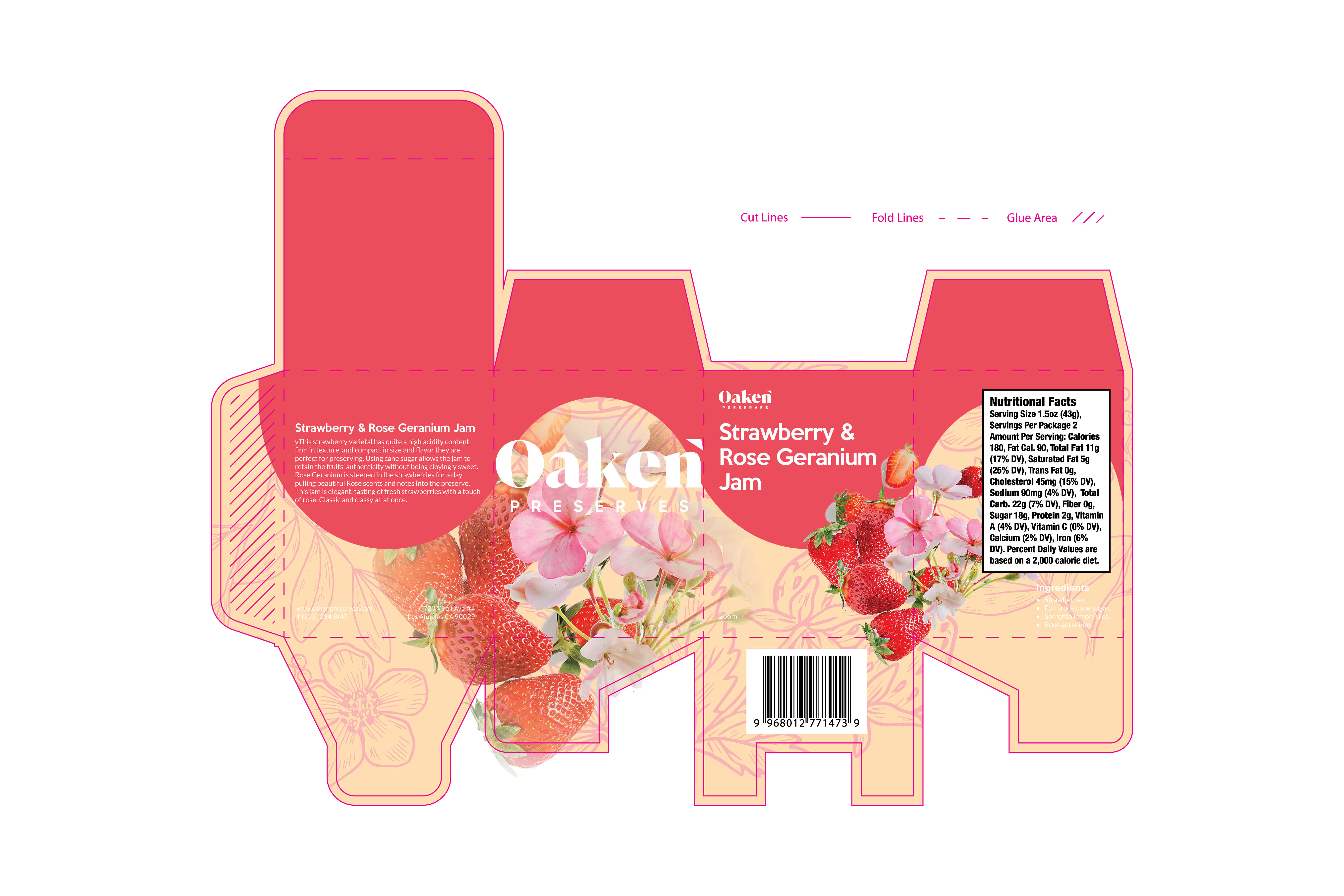
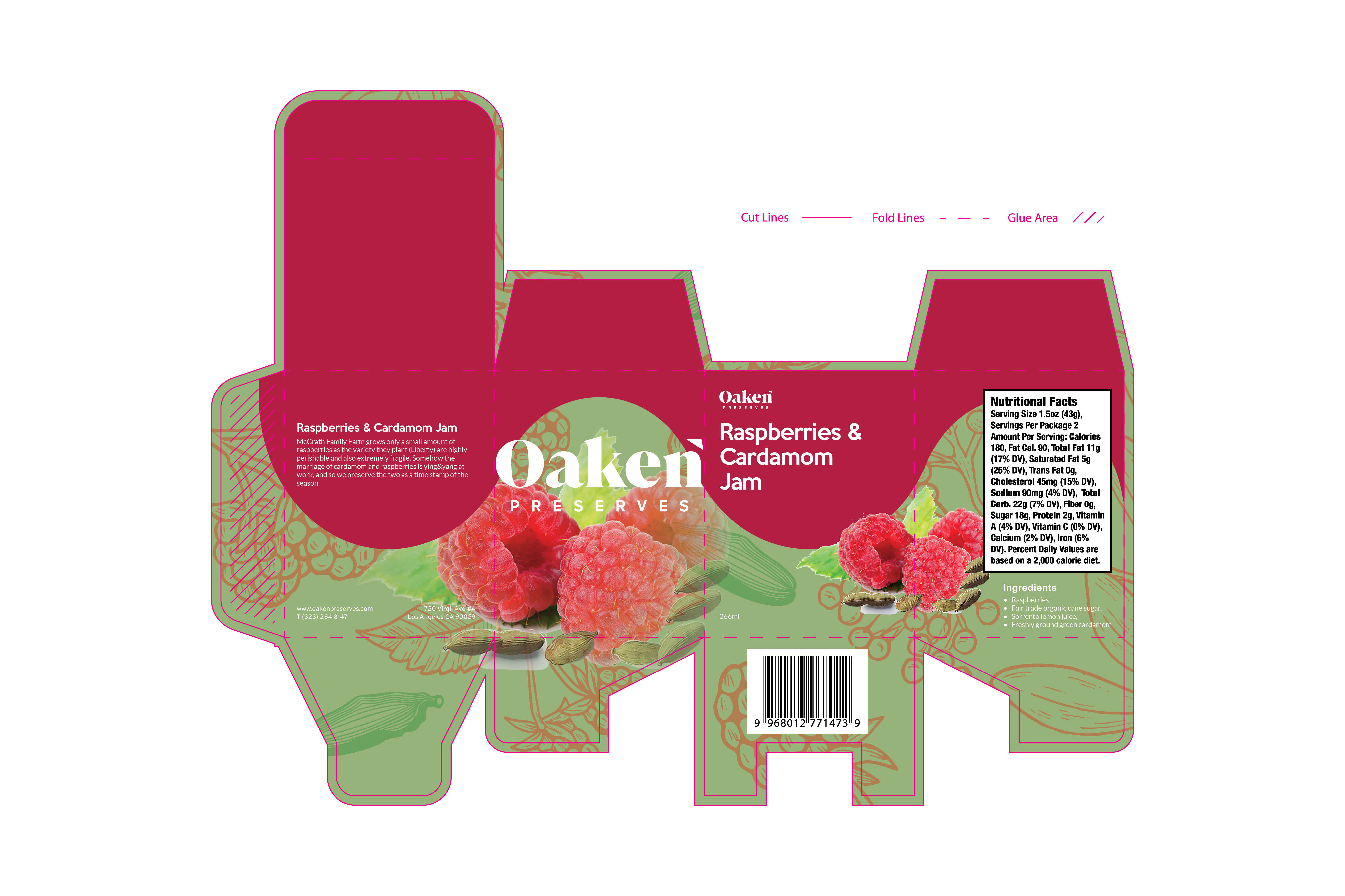
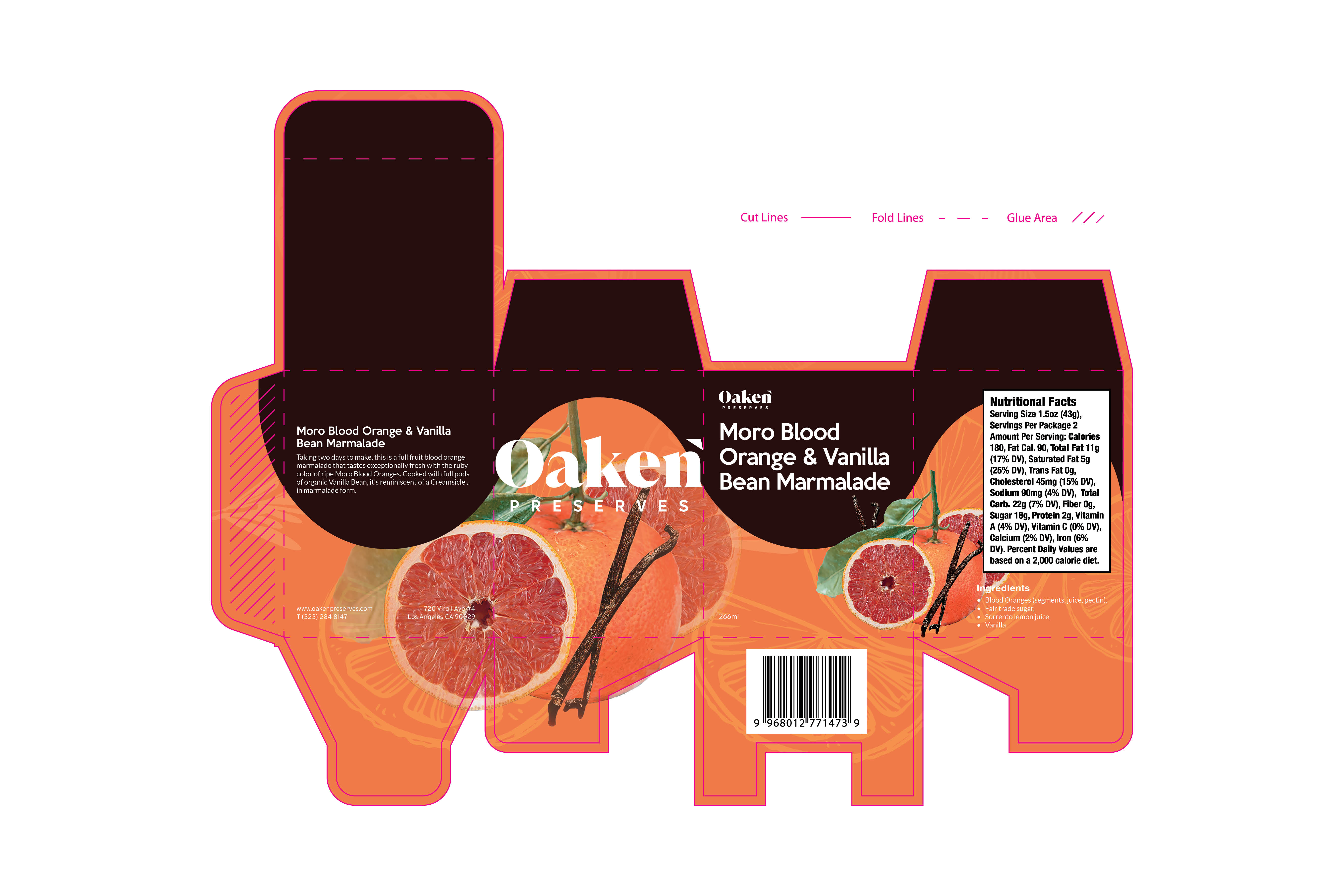
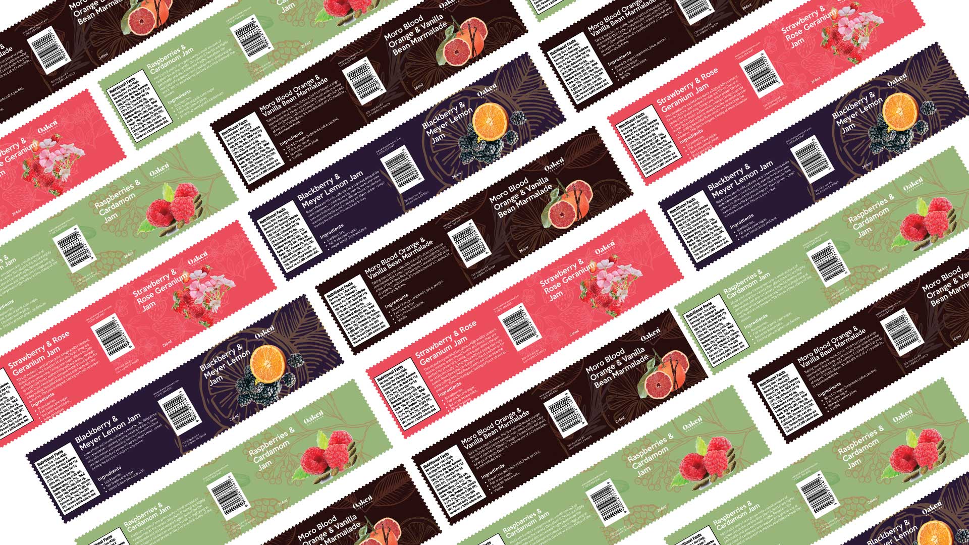
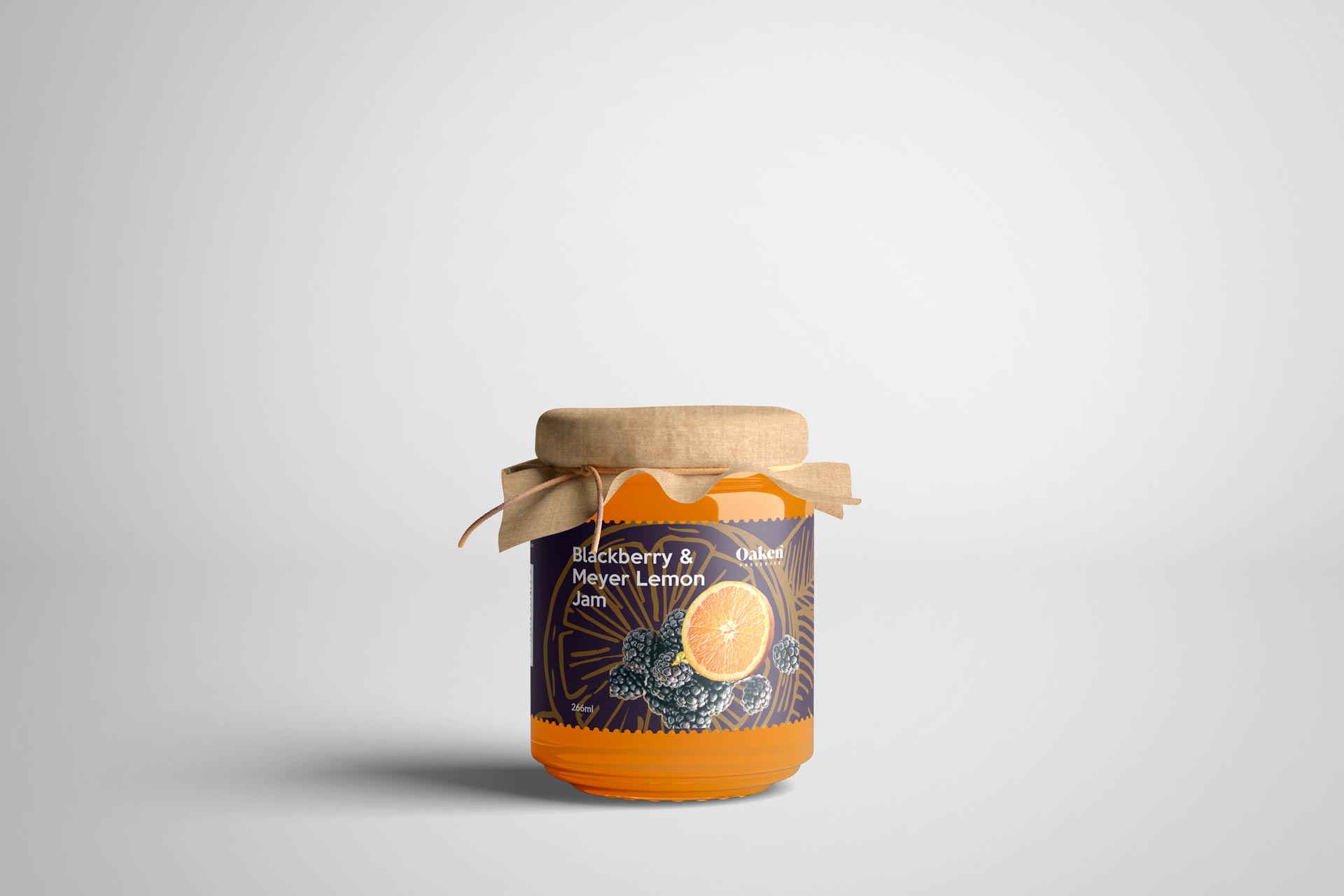


With meticulous attention to detail and unwavering dedication, I successfully crafted a truly remarkable packaging and label for Oaken Preserves' jam products. The client's enthusiastic response to my work was a testament to the vibrancy and allure of the design. The packaging's captivating colors and irresistible charm seamlessly achieved the desired continuity across the product line, presenting a cohesive and visually stunning display.
By marrying aesthetics with functionality, I delivered a packaging solution that not only captured the client's vision but also resonated with their target audience. The harmonious blend of artistry and practicality resulted in a design that effortlessly stood out on store shelves, beckoning customers to explore the enticing flavors within.
The joy of witnessing the client's genuine appreciation for my work is a testament to the power of effective design in establishing a strong brand presence and fostering customer loyalty. With this successful collaboration, I take pride in knowing that I played a pivotal role in helping Oaken Preserves make a memorable and captivating impression on consumers, solidifying their position as a trusted and sought-after brand in the world of jams and preserves.
